September 28, 2026
When we started making dashboards as a native feature of our product, our users kept asking for an Excel export of every chart.
For an engineer this is a trivial task, we could have just turned the json calls into csv and called it a day, but we were curious. We had already organized the data, ran the joins, provided the filters and built a responsive UI. What did spreadsheets do that we don’t?
We asked what they did after we gave them a csv.
They wanted to add a “Notes” column to the side, to put their thoughts about the numbers. Send a finding to someone who would know if that was right or not. Add an exception about an unusual expense, so that they could answer a follow-up question quickly.
The chart had helped them notice something, the pivots helped them narrow it down. The spreadsheet had helped them record it for the future.
Export didn’t solve the collaboration problem, because nobody could see the Notes column when they went to the dashboard again.
This was an open loop we wanted to close.
A good dashboard does something valuable: it gives a large body of data narrative purpose.
“What do you want to explain?” is a powerful design question when building a dashboard. It turns a million rows into an intelligible view of revenue, spending, inventory, or risk. A good dashboard is a set of choices made to show what matters and helps someone navigate to the answer buried in the data.
We sat down with a customer who took 3 different PowerBI dashboards which opened side by side, with an assistant opening the related ones across each of those in a big screen to explain how a budget reallocation would work. They told us that the integration was impossible today because half of the systems here were SAP and the other half was Oracle. They wanted all of it pulled into a single excel sheet if possible as a first step. We convinced them that we could get AI to put those three views together and draw the lines they were implying in the UI live. They didn’t believe us till they saw a demo and now the past, present and future with data connections in between them are popping up everywhere.
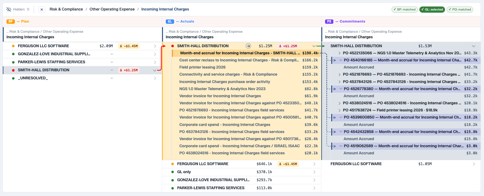
The hardest problem with historical data is cleaning it and preparing it using a data model for a dashboard. The ease of which is why we get the kind of customers we have today.
Once you clear the messy data into something that represents a close approximation of reality, you can build a compelling presentation layer for your data with Aidnn. If you have worked with a Big 4 consultancy, the presentations they make lay out a business case with all the power of the data behind them, but cut down to fit into a static display. PowerPoint presentations fill the niche pretty well, but interactive dashboards can describe a narrative and pull the underlying data to answer questions immediately.
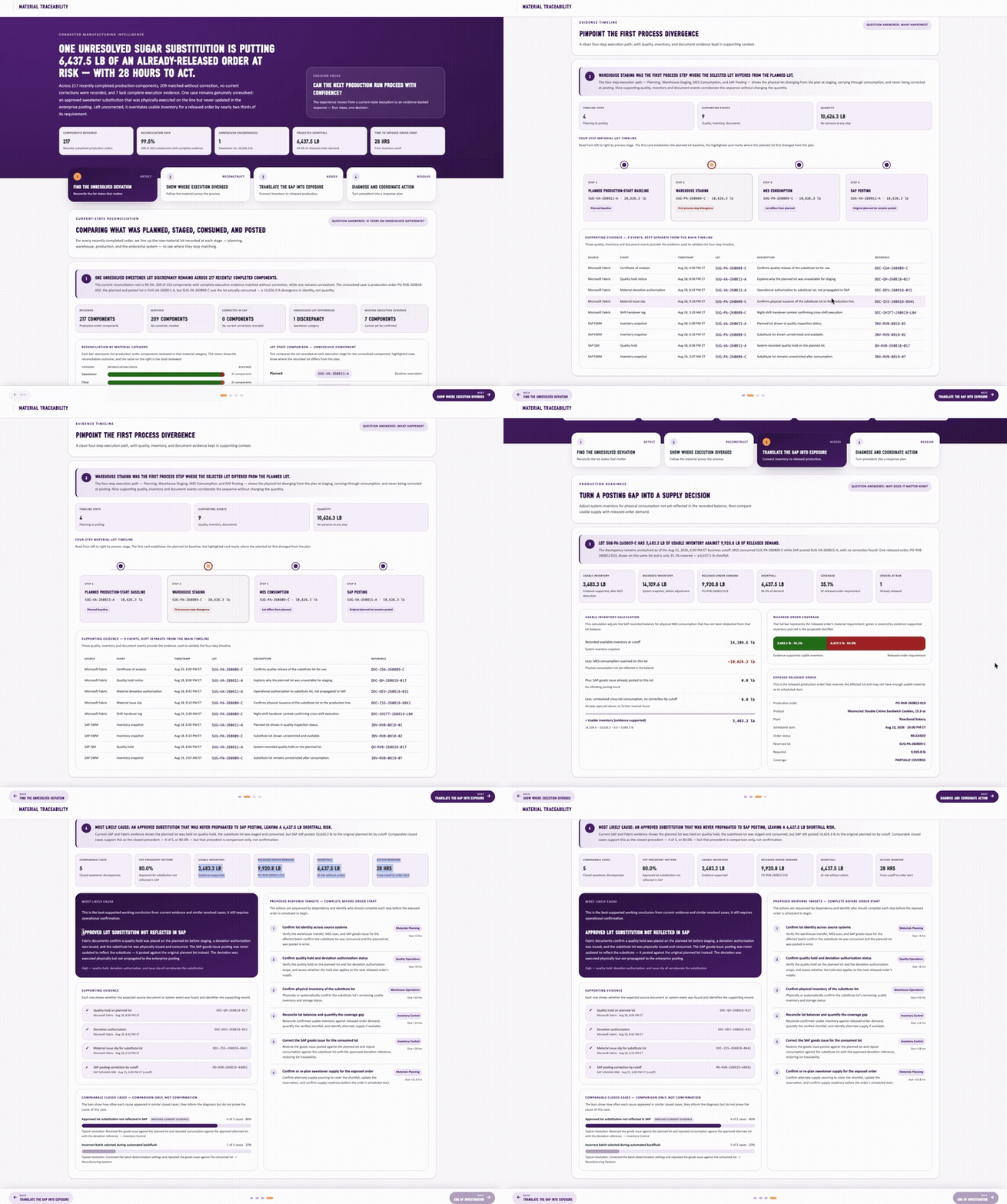
The existing collection of tools are not good at exploration along preset pathways. An Excel export of a dashboard is a compromise, it lets you start building a new pathway, but often asks you to build up the data connections from scratch.
The difficulty starts when the audience wants to challenge the story presented.

We need a top-level narrative for a presentation: what happened, why it matters, and what we think should happen next. Beneath that narrative, we need a solid foundation of data to demonstrate it. Then we need a way to dive into that data and poke at the assumptions until we know where the story holds and where it needs work.
Imagine a finance controller presenting a rise in AI token spend and recommending tighter controls. There’s a chart in the spending dashboard which shows the increase, time frame and even the projects it should be billed to. But someone asks if the extra spend reflects higher prices from a discount expiring, higher usage of existing capabilities, or a new capability which is suddenly hitting traction.
Now the team needs to dig deeper into the projects and go over the exact root causes. See whether the increase persists when new project launches are accounted for. This was just in the pre-read meeting, so we leave it with open questions.
Someone should be able to leave a note against the relevant bump, addressed to the owner: “Can you confirm this issue is fixed?” The recipient needs the evidence and the question together. Their reply should remain there, ready to inform the next version of the presentation to the VPs.
This is one continuous piece of work, yet it can span slides, a dashboard, a workbook, and an email thread. Each move asks a person to carry the context across by hand.
The first is portability.
A finding becomes useful when the right people can work on it. If adding every additional reader requirescreates a licensing conversation, sharing becomes a purchasing decision. The old Acrobat distinction between an editor and a Reader captures a sensible expectation: the audience for a document should be able to grow beyond the people who created it.
Data needs a similar freedom of movement. Where the available detail supports it, someone should be able to regroup a business-unit-by-vendor report into a vendor-only report without starting over at the source. The application can carry the necessary data extracts with it, so the responses are immediate. Every pivot or filter doesn’t have to spin up a warehouse and go over all the data gain.
The second is preserving a point of view.
A dashboard link can arrive with a small operating manual: open third-party spending, select this business unit, choose this vendor, change the date range, then find the expense report near the bottom.
An application should do this automatically when sharing: preserve the filters, grouping, selection, and relevant period so a colleague can pick up the investigation from where it was left.
The third is a place for the explanation, from both humans and AI.
Excel makes an underrated feature almost effortless, adding a Notes column.
Beside a variance, someone can write, “Annual renewal paid early,” or “Approved by Joe” In a shared workbook, a colleague can supply the answer beside the evidence that prompted the question. We can do one better, give the question to an intended recipient and make it clear whether the follow-up is still open or has been resolved.
A live dashboard makes this harder when the data refreshes, rows move, and yesterday's observation loses its place. A useful annotation needs a durable connection to the item being discussed and enough historical context to explain what the person saw at that point in time.
Spreadsheets are still as powerful to do all of that, they’re just hard to navigate easily once you have modeled and forecasted everything you need. To straddle the worlds between them, we cannot make “move all your data into a warehouse” the entrance fee.
For many teams, the working dataset is already a shared Google Sheet. That should be a valid starting point. A warehouse can support the application as more data comes in, but vertical integration between dashboard vendors has perverse incentives. The dashboarding tool becomes a demand driver for warehouse costs, where exploring non-warehouse data with them cuts into the revenue.
The obvious advantage a warehouse brings is security for the datasets. Unlike just sharing a whole sheet, a dashboard constructed out of one does not mean giving everyone access to everything in it. The underlying data and each person's authorized view need to be separate. In our product, view scope ties access to the user's login, so executives can work with their authorized portion of the data off a spreadsheet without maintaining separate copies.
This is where the spreadsheet starts becoming the skeletons of an application. It gains structure around who can see what, how people investigate it, and where their decisions live.
AI gives us a new way to make this application accessible.
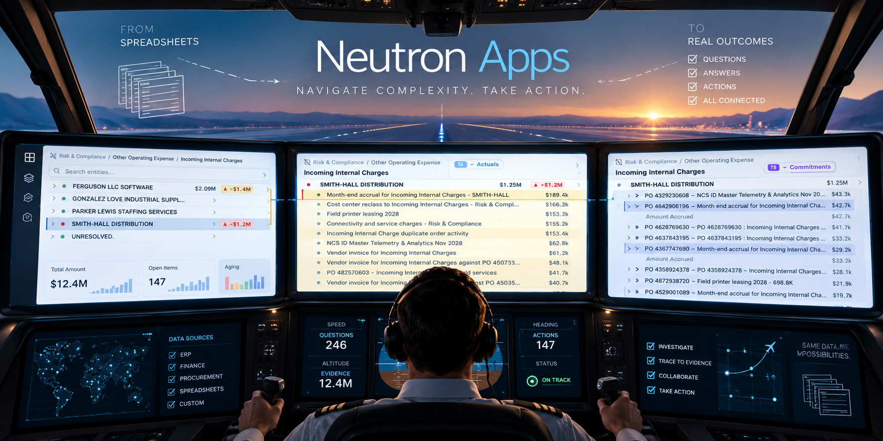
What we’re building becomes more of a flight cockpit than a dashboard. It is not something you will glance at while operating the real wheel and pedals. The instruments and controls are integrated into a single pane, where a pilot can observe conditions, investigate what is happening, and act. The interface is designed to support an ongoing activity, not present the end result.
Business software needs that continuity too. A spending variance should lead naturally to the transactions behind it, the person responsible, the explanation, and the next step.
Traditionally, exposing all that depth has meant exposing a great many controls. AI can offer a simpler starting point: an intention expressed in ordinary language.
“Show me what's driving the increase in this vendor's spending.”
The application will open the relevant comparison and reveal the purchase orders. The user could test the timing assumption, try a different grouping, and inspect the basis for the answer. An unresolved question could become a note addressed to a colleague, with the transaction and the current view attached.
We offer a lightweight exploratory interface without hiding the real levers which can be progressively explored by a user without a heavy user manual. That makes easy things easy and hard things possible.
“Make it so” is a compelling interface.
A flight deck should also come with a flight recorder: a “black box”, even if it is orange.
It should preserve the evidence behind a decision: the data as it was, the view used to examine it, the assumptions challenged, the notes addressed to colleagues, and the answers that followed. When a conclusion changes, the record should make the reason visible.
In the spending example, the live data may look different next month. The flight recorder should still let someone reconstruct the original claim, the question about the project with the bug, the reply and how that reply affected the recommendation. A saved filter alone cannot do that, the record also needs the relevant data overlays underneath.
That history is useful in the next meeting, when somebody asks, “Didn't we already look into this?”. It lets the team resume from what it learned, with open questions and their intended owners still in view.
For a customer to draw the maximum value from moving to such a system, the resulting application has to be intentional, specifically shaped around their actual day to day work. It should make large datasets navigable and accessible while preserving the detail people need to investigate. And it should let questions, answers, and actions stay connected to their evidence.
After building several such examples for customers, we have learned that the underlying data foundations can be consolidated into a well defined specification without compromising the completely unique visual experience within the application. Each one we build like this seems to trigger three more elsewhere across the customer’s teams.
You could call them different Isotopes of the same basic elements.
Apropos of that, we call these Neutron Apps. With this, we’ve built a new way of building data heavy applications which can close the loop between the applications people wish they had and the spreadsheets they’ve made instead.
Try refreshing your page once you hit save - apps/tensor-scenario-planner/
All of this started with us asking “Yes, but once we send you the export, what do you do?”.
Cockpits aren’t dashboards, because the pilot learns to trust the instruments more than their own eyes.